Universal Music
![]() Awarded at Cristal Festival 2017 in the subcategory: best interface & navigation
Awarded at Cristal Festival 2017 in the subcategory: best interface & navigation
With an idea
And actually no idea of the work tied to a site of this scale. From the pitch to the research to the wireframing to the design and the creation of interactions and animations, it was a long road. One that was fun and one I want to talk about in this case. Thoughts, ideas, and questions we tackled and solved.
More than a facelift
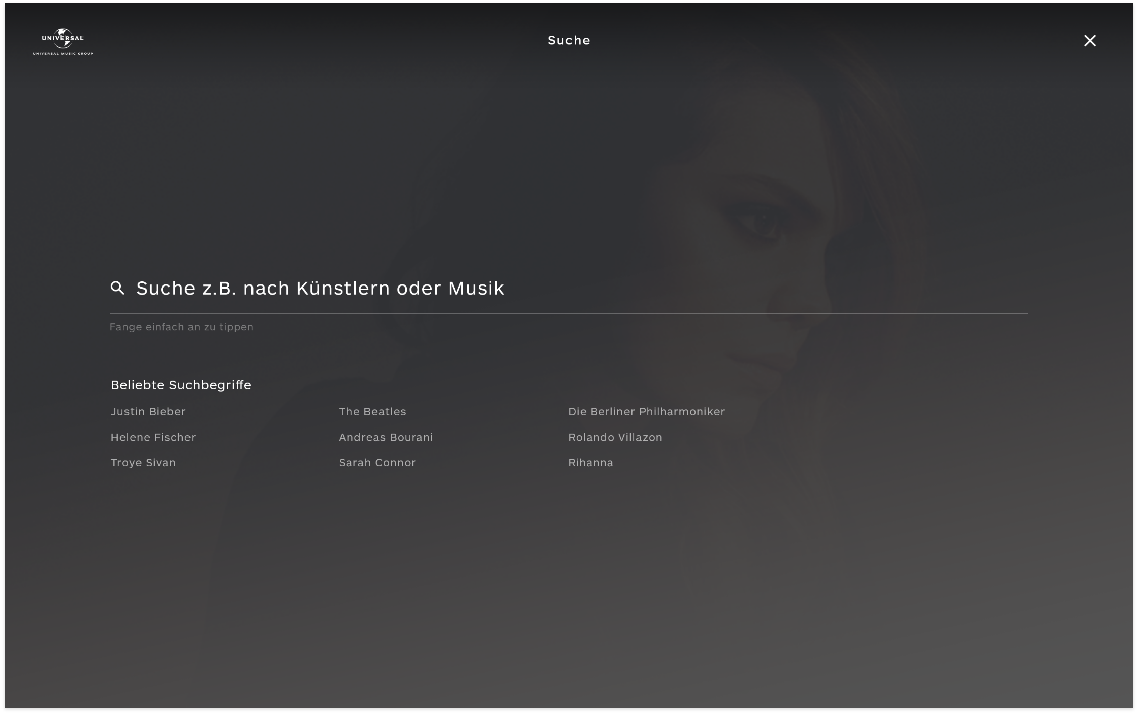
Try it for yourself and search for any artist that goes through your mind. Chances are, you'll find that specific artist under the Universal Music Group.
Now add pages for events, charts, overviews and lots of single pages that float around the main site. It's huge and hard to put into any dimensionally representative scale.
Thus a project of this scale requires careful design and architecture choices as well as a seamless experience to function properly on all devices and all artists.
A huge challenge.
Consistency is important on large scale design projects. Approaching and trying to solve the problems before heading into the visual design phase is key here.
Don't make me think
A key phrase introduced early in the briefing and reviewed along with the design process. It refers to the need of everything being self-explanatory and easy to use.
For the design it means that key elements should be clear and simple, user-interaction intuitive and learning processes supported by instructive elements.
One
step
ahead.
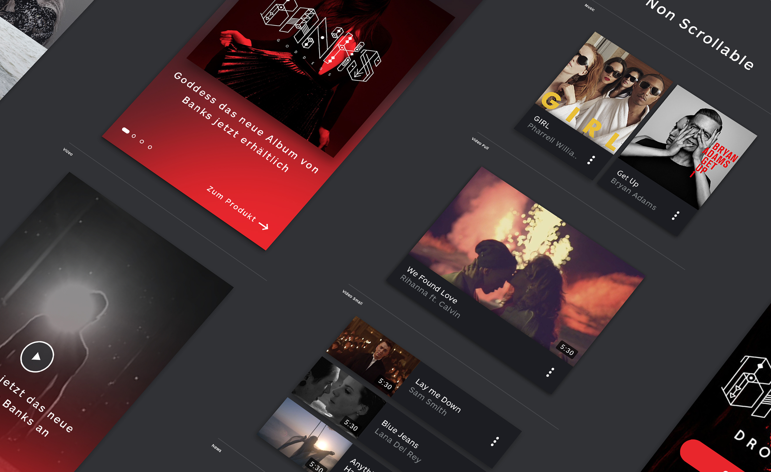
Throughout the design, there are a lot of elements that offer suggestions to the user. The most dominant one is seen in the navigation. Using suggested and featured content helps the user to find desirable content as well as UMG to channel specific content. Frequently visited artists are a step closer and new artists have a place to get attention and promotion.
Restructuring
the
content
Introducing
the
genre
selector
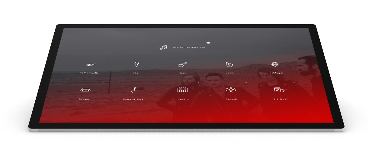
On the old Universal-Music website, the genre-specific pages were bloating up the whole navigation. Every menu element was subdivided into each genre resulting in a mess.
With the introduction of the global filter, we are getting rid of the bloat as well as introducing a new personalized way of browsing the new website. Want to see Jazz-related music and news? Just apply the filter, once, simple as that.
We designed a flexible & modular, component-based system that is able to adapt to any situation.
The color shade generator
Try to design a website that suits both Sunrise Avenue (Rock) and Dua Lipa (Singer-Songwriter) in a single design.
Let me tell you it's hard. First of all, you need to work with a base design that is neutral. Then you need to make sure that you can personalize this base design so that it suits your artists.
Next, you might want to consider checking back if everything is still in the flow of the big picture, the corporate site.
Checked that? Great. But what about the poor people who have to actually build those sites?
Restricting the freedom of the editors might seem like a wrong choice at first but think again.
While there is no doubt that some editors might enjoy the full freedom it's questionable for how long? 10, 20 or 50 artists before it becomes a burden?
The editors have the full freedom of re-arranging modules and choosing the images but the colors are generated through a predefined algorithm after setting a single base-color.
This allows a certain degree of control for the editor while also making sure that elements are legible and colors don't go wild. All this helps to keep a uniform look.
Final Words
I am glad that I took the opportunity to work together with the guys from Dunckelfeld to create such a well-rounded experience for the Universal Music Group.
The journey started with a very competitive pitch we managed to win due to our excellent approach - delivering a strong and structured experience that already hinted at the user-experience we planned to design and implement.
In all honesty, the design is nothing that would drop your jar on the first glance. But on the second glance, you realize the scale of this project and how everything is flowing seamlessly together. This is where the design works its magic.
It was an amazing experience working on a website of the dimension and reach of Universal Music. You won't get such a chance very often but we managed to pull it off with a rather small design team of only Michael Fuchs and me. In this process we designed over 200 screens for each viewport that were a few thousand pixels long. Additionally we had at least the same amount of wireframes and iterations on our modules. Always refining and validating them in the whole design system.
A fun experience, a challenging experience but we made it!
Personal engagement in this project
Pre-Work
- Pitch
- Presentation
- Vision
UX
- Research
- Competitive Analysis
- User-Flow
- Red Routes
- Responsiveness
- Wireframes
- Interaction
UI
- Modularization
- Customization
- Visual Concept
- UI Elements
- Styleguide
Production
- Art Direction
- Visual Design
- Interaction & Animation