Preface
Questback is an online, people focused, feedback and survey company. They help other companies understand their customers, engage their employees and outperform markets.
In this project, we took our hands on a new product that was being developed in-house called Portals. Questback Portals is an enterprise feedback management platform. It is customizable and tailored towards the client's needs.
A new product paired with a challenge to create a fully flexible and versatile system that needs to be able to adapt to various situations was the challenge. On our road to the final product, we have worked strictly in modules and kept an eye on compatibility across the board.
Design is often perceived as a visually driven field. Wrong. Projects like Questback show the importance of design systems behind the visual layer.
The rise and fall of the modular system
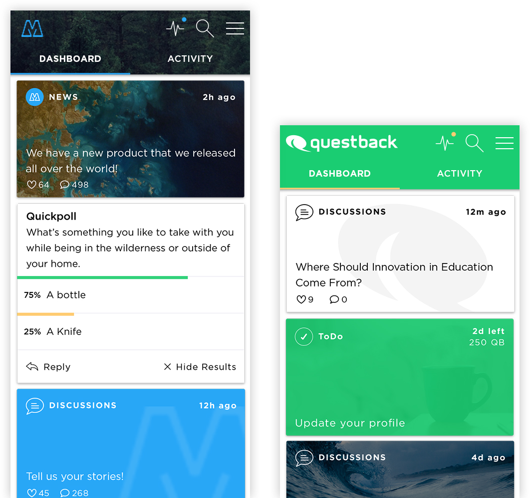
Questback is a tech savvy company and they had clear expectations when they delivered their requirements.
The timeline was tight and the module list long. But it was of utter importance to find the right balance at any time. Because a large modular system rises and falls with the synergy of all components in a balanced environment.
Moreover, the modules had to work across different pages at different places. Thus it was very important to design flexible and customizable modules. Modules that can fit into different roles and adapt to different situations.
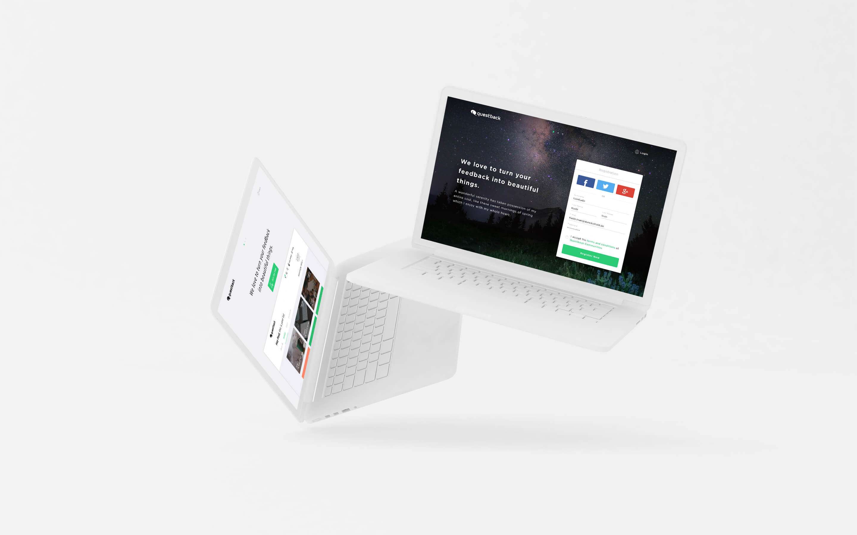
Make it yours, it's easy
Even as a user, the experience you have is customizable through options in content creation.
Therefore it was important to make the steps clear and simple. Not only on large screens but also on small screens.
How do you design a service that is flexible in so many ways?
After all modularity and customization have trade-offs. The universal approach keeps you in a few limits. You can’t go over the top with a style or scheme, otherwise it’ll have a huge impact on the module. Unless of course, your aim is to push a certain brand guideline forward that should be omnipresent all over the place. In this case, making the communities feel like branded by the customers that purchased this platform rather than a Questback stamp was important. It ensures that the customers or employees feel at home in their community. It creates an illusion of a place that seems to be native and familiar.
Any color scheme, any structure and any images had to work in this platform. Throughout the design process testing against a list of possible problems raised by the universal approach was mandatory. Many times in different stages. This ensured legibility and the needed flexibility of the platform.
We used three real brands to validate the design against any problems. Using these real brands we build representative models of their communities. Those communities helped to check against flaws and problems of the design.
This step was extremely important to check the modules flexibility and their behavior when using colors of all hues and images from black and white to fully vivid ones.
Personal engagement in this project
Pre-Work
- Design Vision & Concept
UX
- Research
- User-Flow
- Responsiveness
- Wireframes
- Interaction
UI
- Modularization
- Customization
- Visual Concept
- UI Elements
- Styleguide
Production
- Art Direction
- Visual Design
- Interaction & Animation